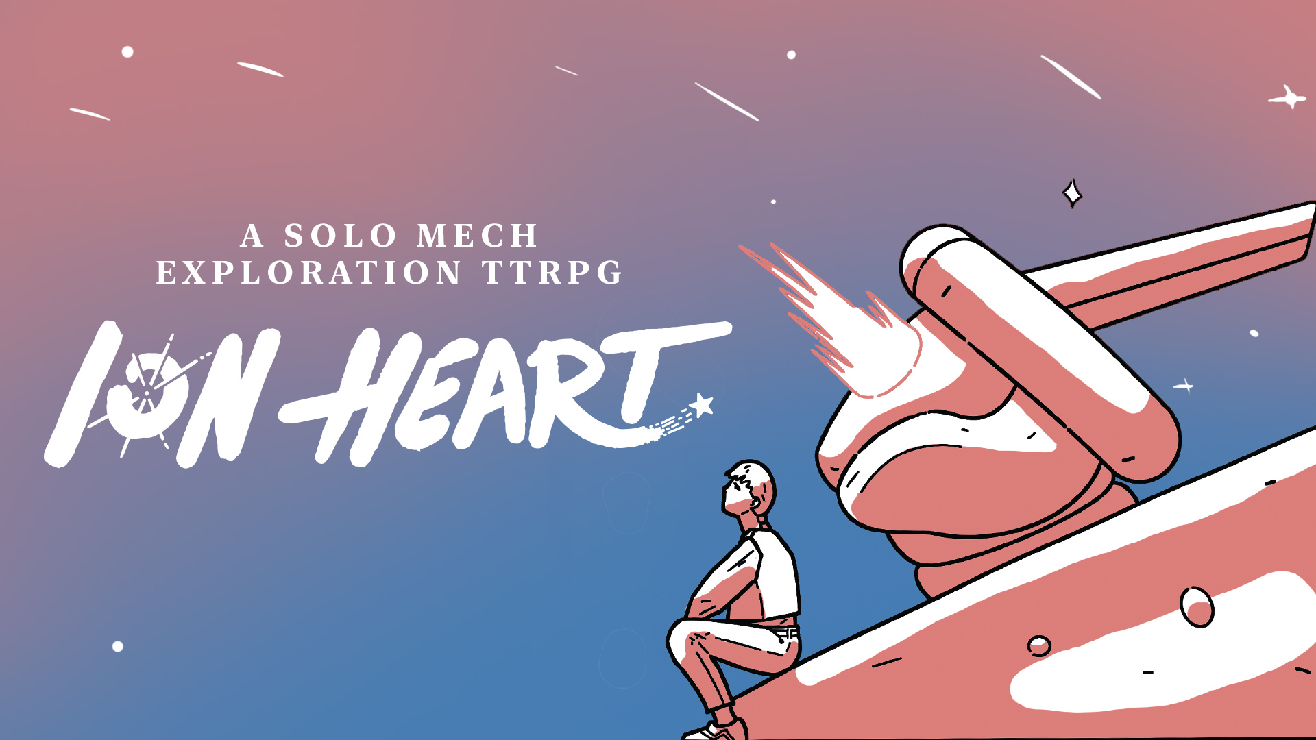
Unsurprisingly when we were working on
ION Heart we spent a long time developing the art style and how we wanted the chilled feel of the Astral Union to be represented in the books. One of the most important things in development which usually comes after you've done the lion's share of the concept work is the front cover.
As you can see the sketch above was the base concept for what became the cover of the pilot's handbook. The other fun part of ION Heart's design was colour palette. We experimented with a number of different combinations before settling on the one you've seen on the
Backerkit page. We thought it would be nice to share some of the other styles we didn't end up choosing.

This concept was one where we played with a softer lighting effect as if the characters are watching the moon above them at night time. This was a popular piece but we ended up not choosing it as it wasn't vibrant enough.

This version had our characters lit in the same way as in the finished version but with a much more blue heavy background. This again was a close call with the final version but we decided the golden-hour look of the pink sky in the final version below was the winner.

So there you have it. It probably won't surprise you that working on the cover is one of the longest and most painstaking processes of making a book as it's the first impression readers get of the world inside. If you've not got your copy of ION Heart yet you've only got about a week to go so
make sure to pledge here.


.png)


